Milk & Honey is a cozy restaurant serving wholesome meals, specializing in all things with a milk base or sweet taste. When creating this company, I wanted to give off the feeling of comfort and family-orientation.
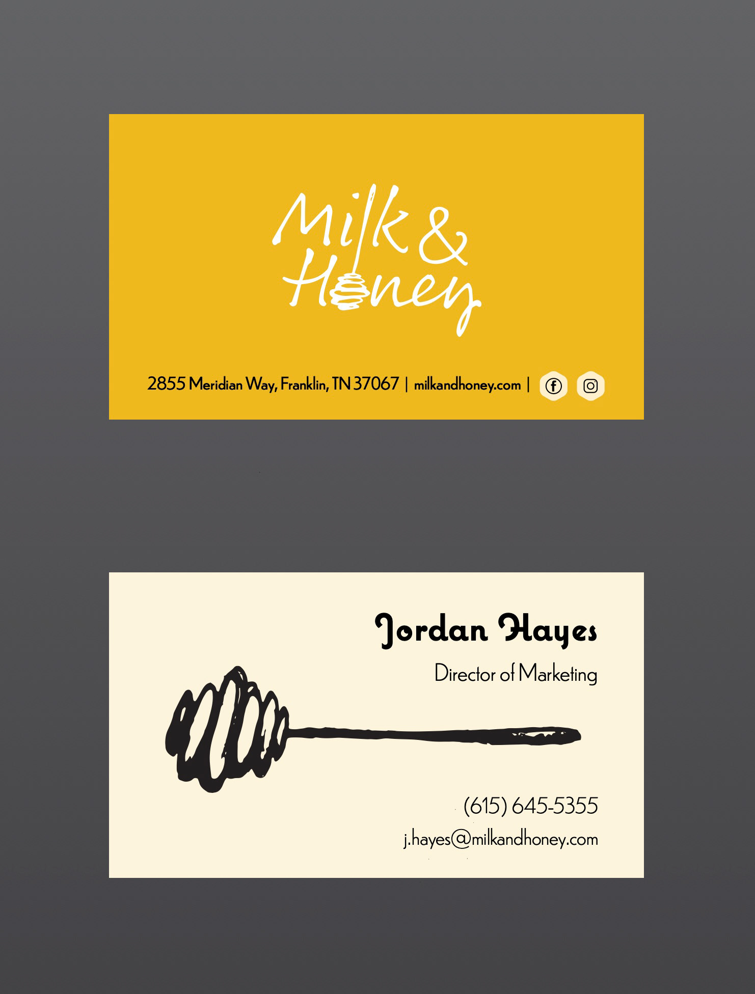
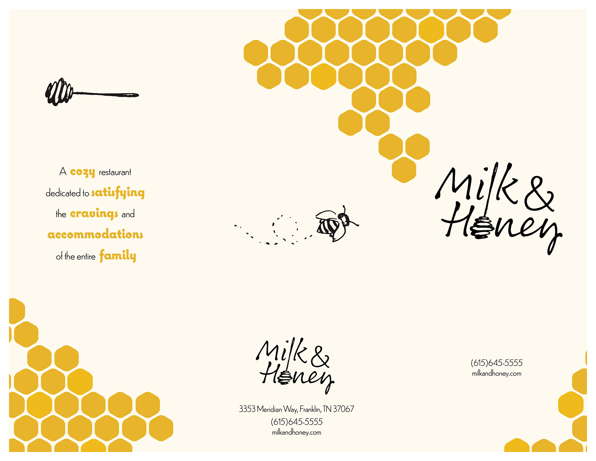
Logo & Business Cards:
I created the logo using a thin, personable typeface and a hand-drawn honeycomb, the same honeycomb that is used to represent the brand on the business cards. I naturally opted for my secondary color of gold, since it ties into the rich tones that are seen in honey.

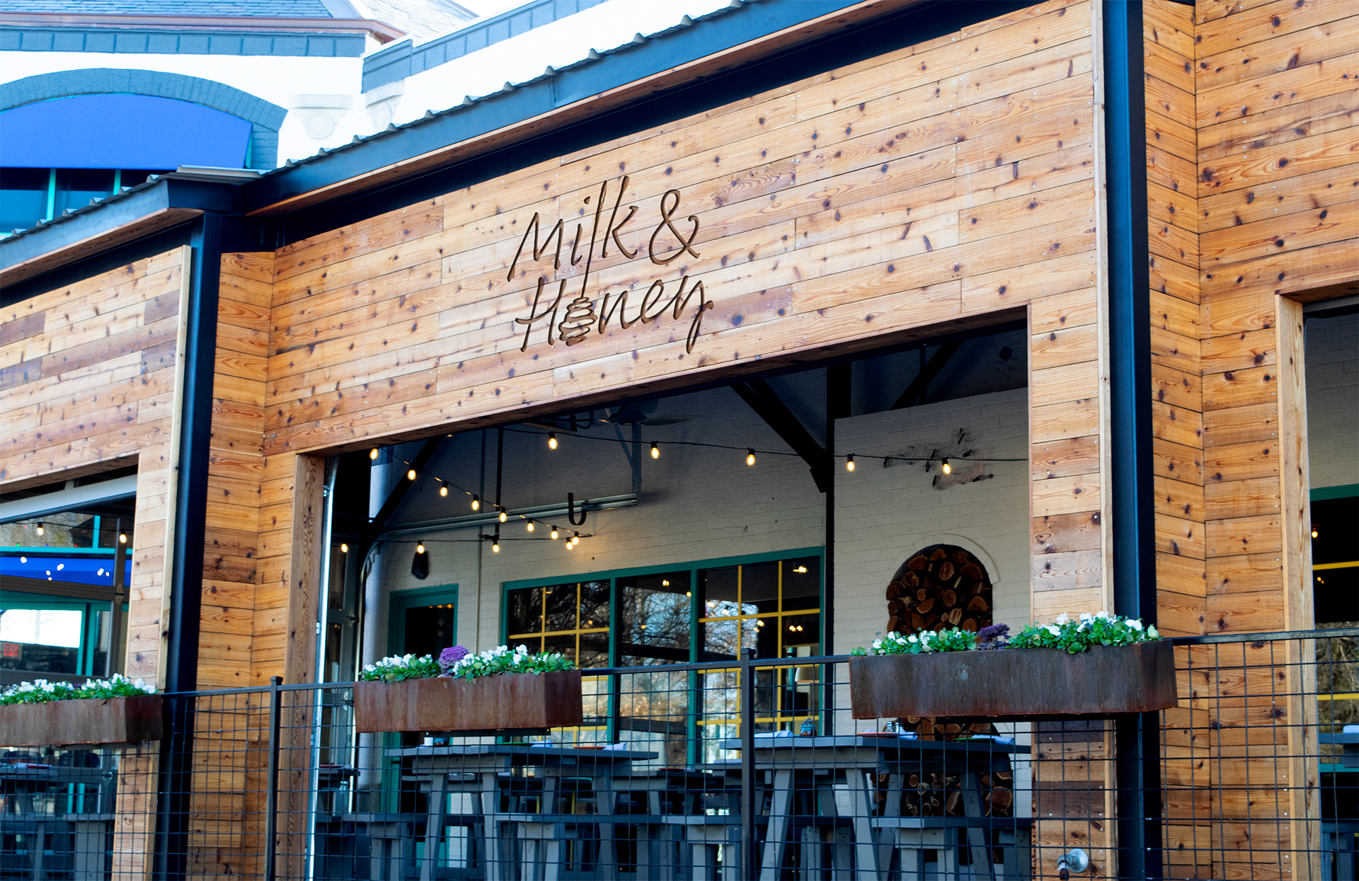
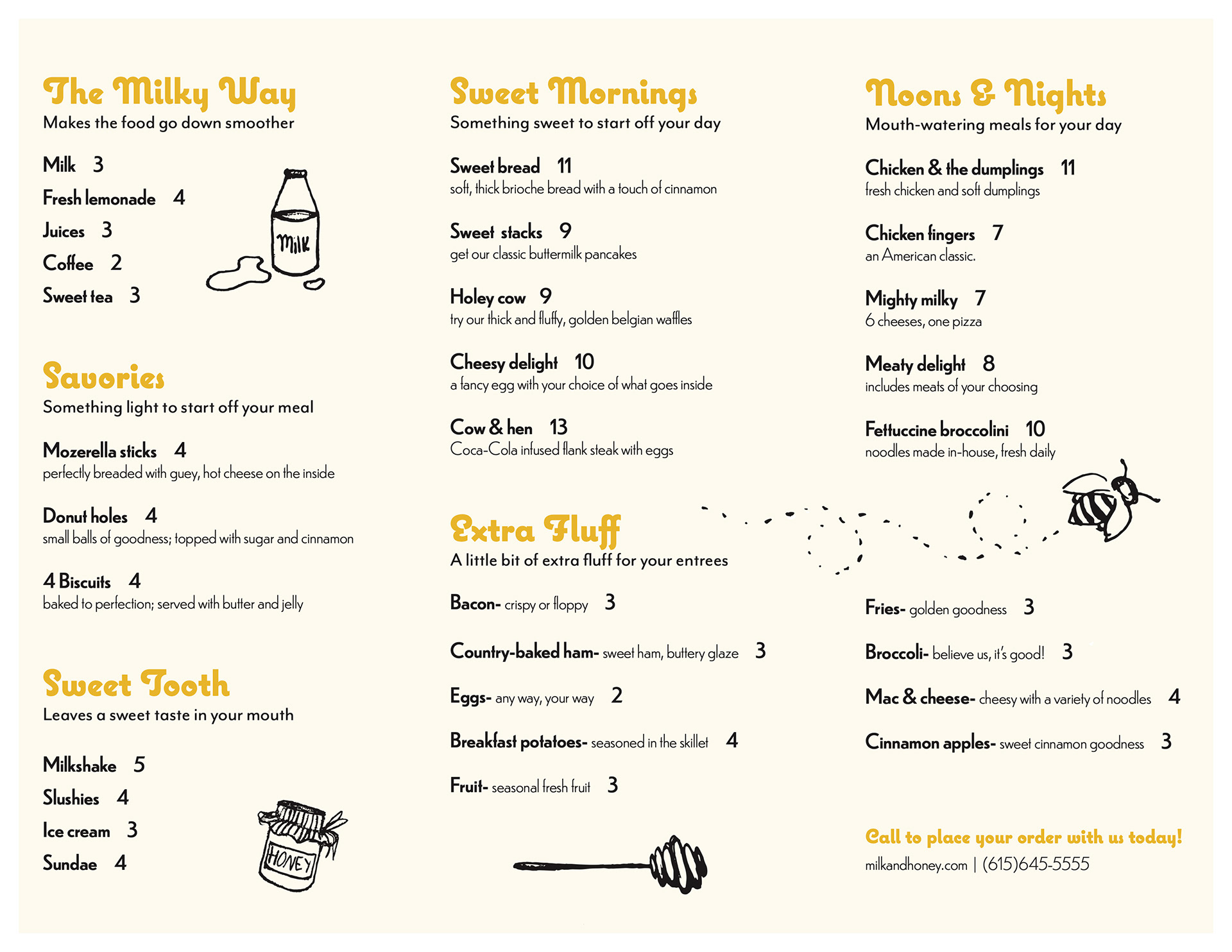
Storefront Signage & Menu:
In the storefront signage, the off-white brick, string lights, and rustic brown wood speak to the comfort and coziness of the brand, and in the menu, the use of the doodles reinforces this family-friendly theme.
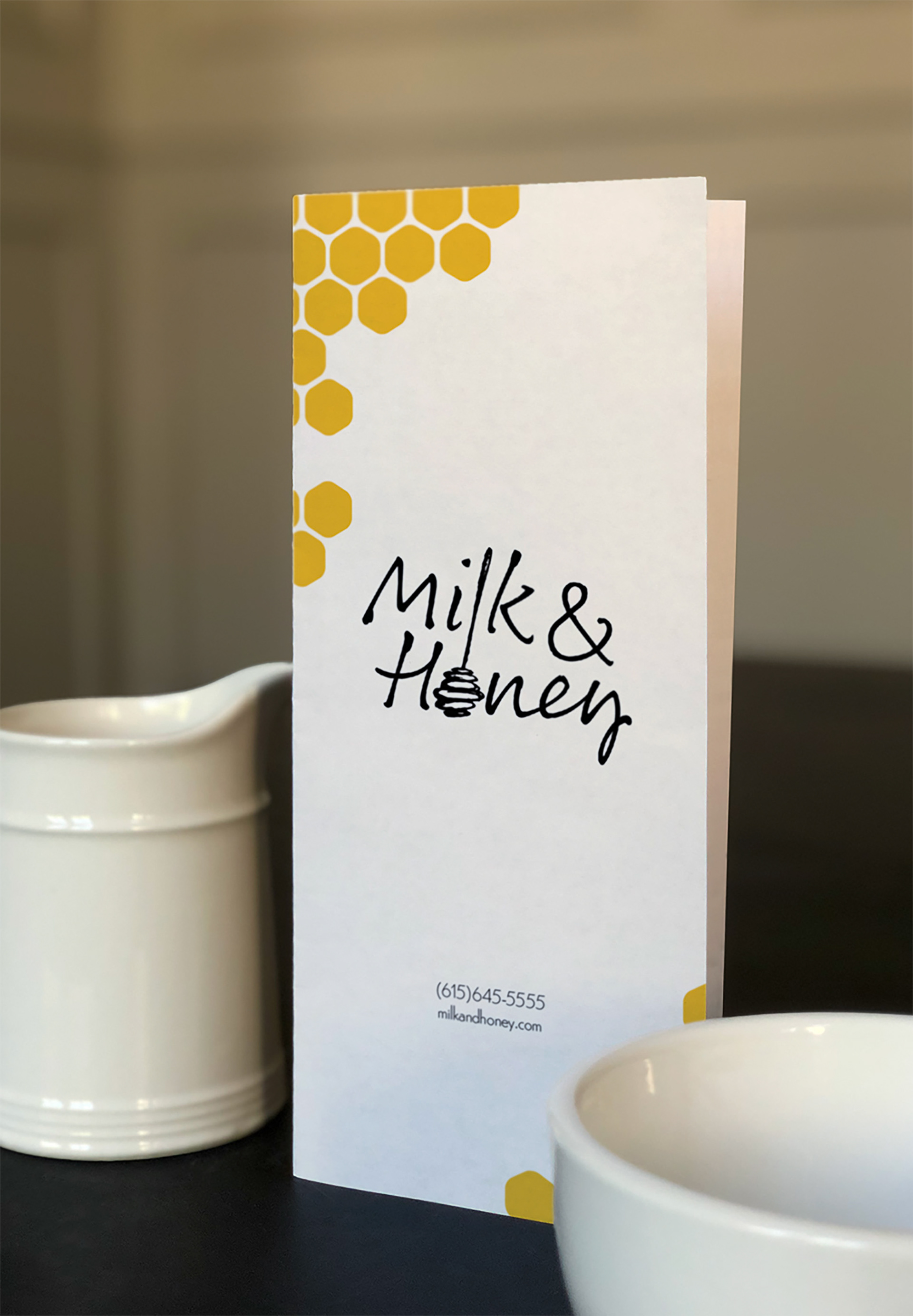
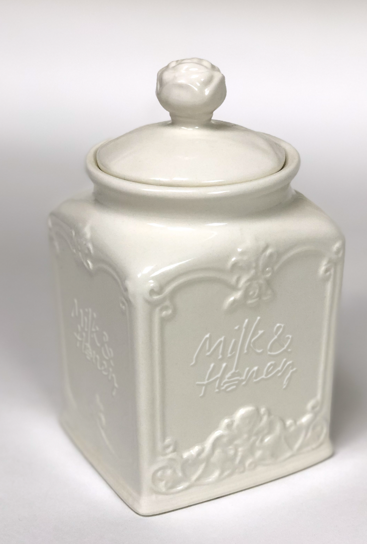
Standing Menu & Canister:
The off-white sugar canister, milk cup, and mug were chosen not only because they complement the secondary color of gold, but because they are used to prepare products that we serve to our families at Milk & Honey.
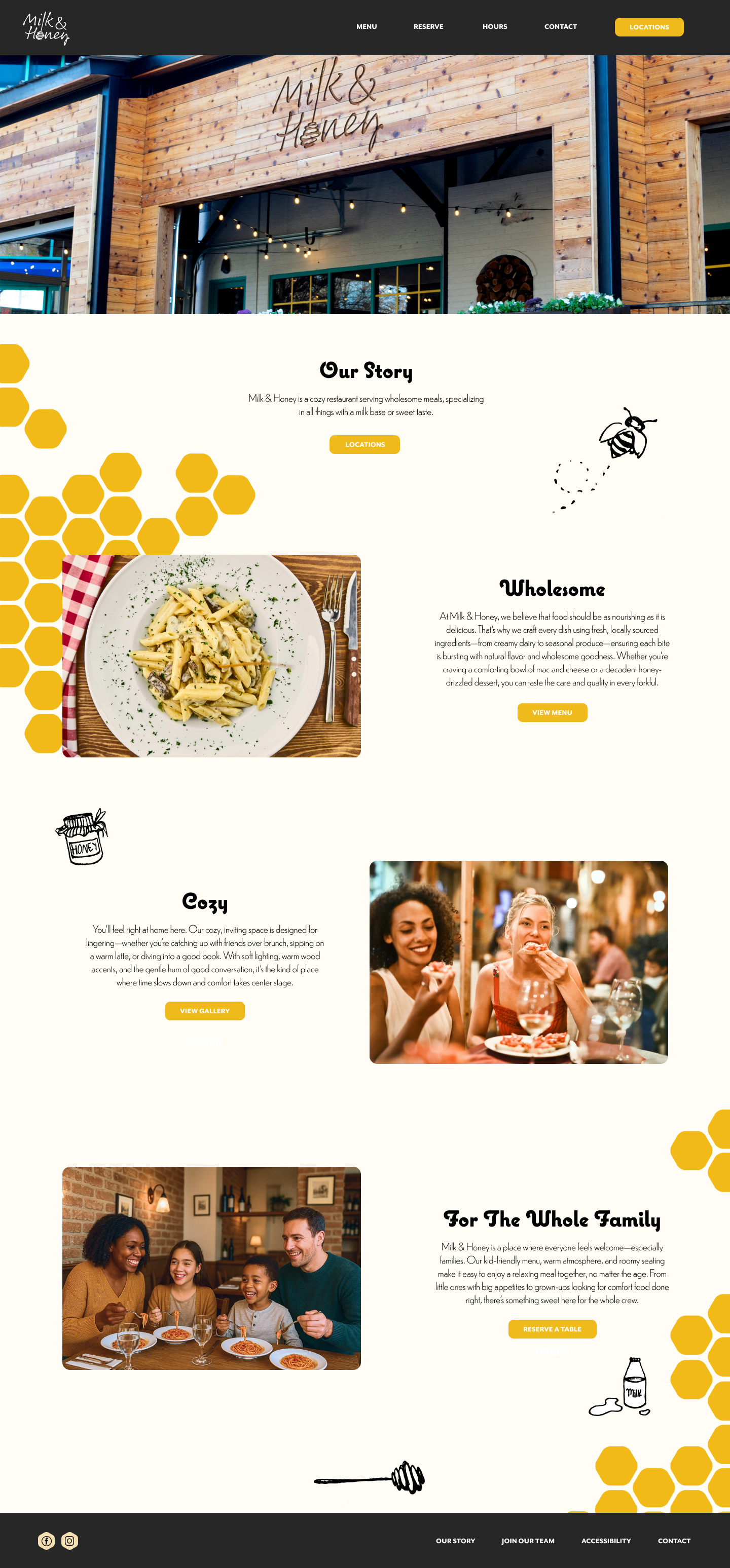
Website Design:
This homepage design uses Milk & Honey's warm and friendly branding to create an approachable and enticing online presence.